In this post I explore NYC yellow cab data neighborhood-by-neighborhood. I examine NYC taxi rides from a neighborhood-centric perspective through a set of superlatives that highlight the diverse nature of NYC neighborhoods, as defined by Zillow1. This post focuses on Manhattan neighborhoods, as neighborhoods in other boroughs have relatively low volumes and differ from the average yellow cab trip in other fundamental ways (e.g., higher average distance traveled, low outbound:inbound ratio).
This post uses 2014 yellow cab data sourced from NYC OpenData. I used PostgreSQL, PostGIS, and R for the data management, mapping, analysis, and visuals (thanks to Todd Schneider for his instructions). The charts in this post were made with rCharts NVD3, and the maps were made with ggmap. The analysis in this post can be reproduced via my GitHub repo.
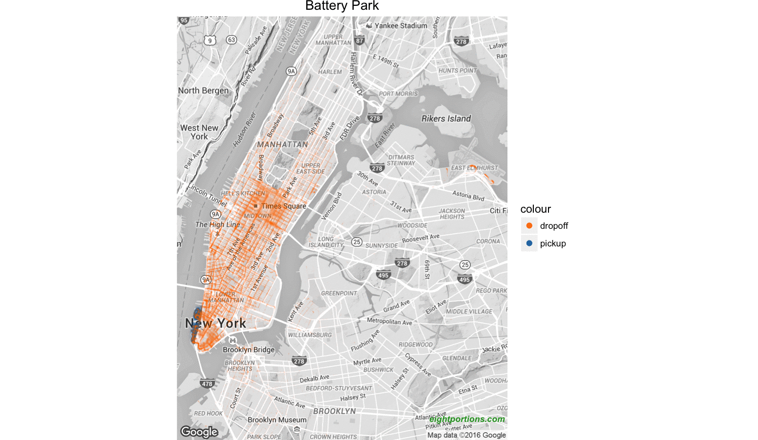
Table of contents
- Top routes
- Most / least likely to pay in cash
- Best / worst tippers
- Furthest / nearest travelers
- Top party neighborhoods
- Most / least diverse
Top routes
Table 1 outlines the top neighborhood-to-neighborhood routes in 2014. The list is dominated by three neighborhoods: the Upper East Side, Midtown, and the Upper West Side.
Table 1: top routes
| Pickup neighborhood | Dropoff neighborhood | Trips |
|---|---|---|
| Upper East Side | Upper East Side | 6,842,026 |
| Midtown | Midtown | 5,353,220 |
| Upper West Side | Upper West Side | 3,975,588 |
| Upper East Side | Midtown | 3,841,041 |
| Midtown | Upper East Side | 3,674,126 |
| Garment District | Midtown | 2,325,275 |
| Midtown | Upper West Side | 2,144,275 |
| Midtown | Gramercy | 2,123,459 |
| Upper West Side | Midtown | 2,074,491 |
| Gramercy | Midtown | 2,031,802 |
Each of these three neighborhoods are geographically large, and likely contain more people available for pickup than other neighborhoods. Additionally, depending on the destination, public transportation from these neighborhoods can be tricky2. Lastly, it’s conceivable that people in these neighborhoods may differ from people in other neighborhoods in a way that increases their propensity to take cabs (e.g., disposable income, preponderance of expense accounts, value of time).
Figure 1 shows the same trip volumes split by time of week. It indicates that there are significant differences in the popularity of certain routes based on the time of week. Likely driven by commuter traffic, routes ending in Midtown are far more popular on weekday mornings than on weekday evenings, while the opposite is true for routes originating from Midtown.
Figure 1: top 10 routes by time of week
Most / least likely to pay in cash
- Definition: percent of trips paid in cash
- Scope: Manhattan pickups
- Most likely to pay in cash: East Harlem pickups
- Least likely to pay in cash: Battery Park pickups
According to the Urban Institute, households in Harlem are 2.15 times as likely to be unbanked as the average Manhattan household3. This could be a contributing factor, but it’s hard to say how much of the cash-card disparity is caused by underlying household financials.
Figure 2: % of trips paid in cash by pickup neighborhood
Card usage for NYC yellow cabs peaks during weekday commuting hours; cash fares are most likely on weekends, mid-day on weekdays, and late at night on weekdays. Figure 3 shows that a larger share of Harlem’s pickups originate during times associated with high cash payment rates, relative to the rest of Manhattan. However, adjusting for the time of week would only push Harlem’s cash payment rate down by 0.1 percentage points4, so other reasons must be driving Harlem’s high cash payment rates.
Figure 3: % of trips paid in cash by time of week, excluding holidays
Best / worst tippers
- Definition: mean tip percentage
- Scope: Manhattan pickups paid by card5
- Best tippers: Midtown pickups
- Worst tippers: East Harlem pickups
One striking feature of Figure 4 is that tips are noticeably smaller for neighborhoods in the north of Manhattan. Adjusting the average Harlem tip % for time of week, using the same methodology as above, suggests that only 0.1 percentage points of the difference are attributable to the time-of-week distribution of rides.
If you’re a taxi driver, this doesn’t necessarily mean you’ll want to be cruising Midtown for passengers. There are a number of other factors you’d want to consider, such as total expected fare (per minute), supply density, etc. Additionally, this post doesn’t assign any reason for these average tips. East Harlem pickups may experience worse service on average, they could tip less on average due to less disposable income, they could be more likely to give cash tips on card fares (cash tips would likely not be recorded), or a host of other reasons.
Figure 4: Mean tip % by pickup neighborhood
Furthest / nearest travelers
- Definition: mean distance traveled
- Scope: Manhattan pickups
- Furthest travelers: Financial District pickups
- Nearest travelers: Carnegie Hill pickups
Where are Financial District and Carnegie Hill pickups going that makes their average trip so long / short, respectively? Midtown. Midtown dropoffs account for 12% of trips from the Financial District and 17% of trips from Carnegie Hill6.
Figure 5: Mean distance traveled by pickup neighborhood
Top party neighborhood(s)
- Definition: ratio of outbound to inbound trips Saturdays and Sundays before 5 AM
- Scope: outbound trips from Manhattan neighborhoods, inbound trips from all neighborhoods
- Top party neighborhood: Lower East Side
This party index identifies neighborhoods where more trips leave a given neighborhood than enter early Saturday and Sunday mornings (presumably after a late night out Friday and Saturday, respectively). Todd Schneider uses a slightly different index of late night activity here, which identifies late night hotspots by comparing neighborhood pickup volumes during Friday and Saturday nights to volumes from the same neighborhoods during other times of the week. I created my index in order to better measure neighborhoods with naturally high volumes during non-party hours7.
Table 2: Top 5 party neighborhoods
| Neighborhood | Trips out:in ratio | Outbound trips | Inbound trips |
|---|---|---|---|
| Lower East Side | 2.1 | 838,364 | 390,667 |
| Little Italy | 2.0 | 196,477 | 97,469 |
| West Village | 1.8 | 535,312 | 291,217 |
| East Village | 1.7 | 981,213 | 566,563 |
| Greenwich Village | 1.7 | 718,556 | 419,599 |
Most / least diverse
- Definition: Shannon diversity index
- Scope: Manhattan dropoffs, all non-missing pickup locations
- Most diverse: Chinatown dropoffs
- Least diverse: Carnegie Hill dropoffs
The Shannon diversity index gives weight to both the abundance and evenness of pickup neighborhoods for any given dropoff neighborhood. The top three pickup neighborhoods for Carnegie Hill dropoffs account for 70% of its volume (unsurprisingly 40% is from the Upper East Side) but the top three pickup neighborhoods for Chinatown dropoffs only account for 29% of its volume.
Figure 6: Diversity of pickup neighborhoods by dropoff neighborhood
Note: This post is best viewed in Chrome, Firefox, or Safari.
Footnotes
-
Some Zillow neighborhood definitions appear to overlap slightly; where a single taxi pickup or dropoff was found to be located in two neighborhoods (these cases represent 0.02% of all trips) they were counted as two distinct trips ↩
-
As someone who’s lived in each of these three neighborhoods I can vouch for this, especially in Subway deserts ↩
-
Unbanked defined as no member of the household having a checking or savings account; as of 2013 ↩
-
Adjustment calculated as the sum product of the difference in time of week distribution and the overall cash payment rate ↩
-
Total tip as a fraction of total base fare; figures exclude trips not paid for by card, as tips for these fares are rarely recorded ↩
-
This is roughly in line with average: 16% of all yellow cab trips in 2014 ended in Midtown ↩
-
Todd’s late night index might fail to identify neighborhoods that have high traffic volumes during non-party hours, and might mistakenly identify neighborhoods that have low traffic volumes during non-party hours; conversely, my index might fail to identify neighborhoods that have a lot of party-goers returning from other areas, and might mistakenly identify neighborhoods where no one gets dropped off ↩